Responsive Design – Grid Framework
Background
Our old binary.com website was designed and optimized for desktop layout only but when more and more clients joined & started trading, the need & clients requests for making it accessible on various devices started increasing. The clients request were ranging from creating app for each platform be it Android, IOS, Windows or making it usable on tablets/mobiles. After lengthy discussions/analysis we narrowed down our requirements to either creating separate app (be it phonegap or app for each platform) or to make our website responsive using existing grid framework.
This post aims to outline the whole process involved in approach we decided to go with keeping in consideration the time lines, resource availability.
Why we chose responsive design over platform specific apps?
Although not related to responsive design but it provide an insight into why we went ahead with responsive design. The basic requirement was to make it usable on all sort of devices with the least amount of time & resources with minimum maintainability overhead.
Reasons for going with responsive design rather than developing platform specific app were:
- For app we would have to hire developers/freelancers for each platform as there was no resource available within organization, and for that we would have to wait minimum of 2-3 months even for the first beta delivery that too excluding testing it on various devices.
- And for future maintainability, we would have to test, optimize and maintain it with every new releases of platform.
- There were few more internal reasons and discussion which are not explained here.
Please note that the reasons may vary from organization to organization and are specific to requirements.
Next was, which responsive grid framework to use?
Creating our own implementation was thrown out of picture because of time constraints. We boiled down our requirements for grid framework to following criteria:
- No javascript or minimal javascript framework
- Support for RTL language
- Easy to implement
- 960px based but can be customized to any width in future
- Supports Sass
- Based on responsive unit (% instead of pixel)
We searched for loads of framework like unsemantic.com, responsive grid system, less framework, skeleton, gridle. We narrowed down to skeleton and gridle on ease of implementation and minimal learning curve. Finally we went with gridle because it supports sass, support for RTL language and satisfy most of our requirements. We rejected skeleton because of no support for Sass, RTL language and lastly as it was pixel based.
Did we go with Mobile first design?
Mobile first design philosophy is best explained by LukeW blog. As our website was already designed and running so we didn’t get the chance to apply mobile first technique but we considered mobile design in parallel while designing/developing for responsive design. As my personal opinion it’s better to go with mobile first design because if website can be easily used on small screens then it can easily scale to large screens.
Basics of Grid Framework
What is grid?
Grid finds its major use in print design but it’s now recently making its way to web designing. Grid is basically a way to divide the space(canvas/webpage) in uniform units(columns) and is used to arrange content in organized and systematic way.
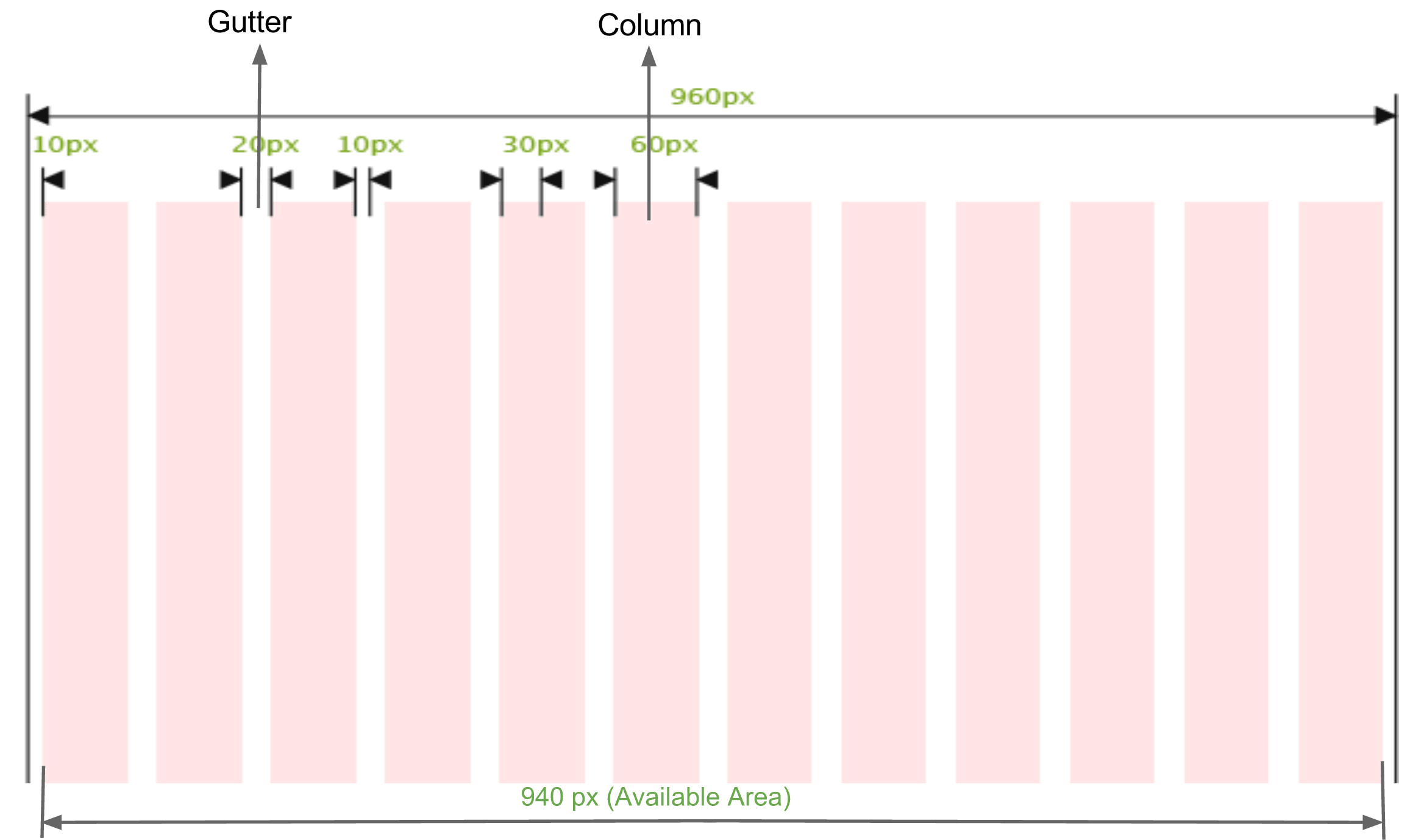
Basic 12 Columns 960px Grid
What is being responsive?
Being responsive is being adaptive to the screen on which it is viewed. In technical terms, it is based majorly on responsive units i.e. ‘%’, ‘em’ as opposed to fixed units like ‘px’, ‘pt’
By using responsive units doesn’t mean we have to discard the fixed units altogether, both type of units have their own significance in responsive design as explained below
Fixed Units: They are used when the style(margin, width) needs to be consistent across the devices/screen like padding, margin.
Responsive Units: They are used when you want content/container to adjust across the devices/screen.
Use fixed units for margin, padding. Use responsive units for container width and font size
What is Gridle?
Gridle is responsive framework that is based on states that are basically abstract media queries (in simple terms it automatically adjust the content as per the device). For more information check documentation on gridle.org
Example
Consider two div parallel to each other
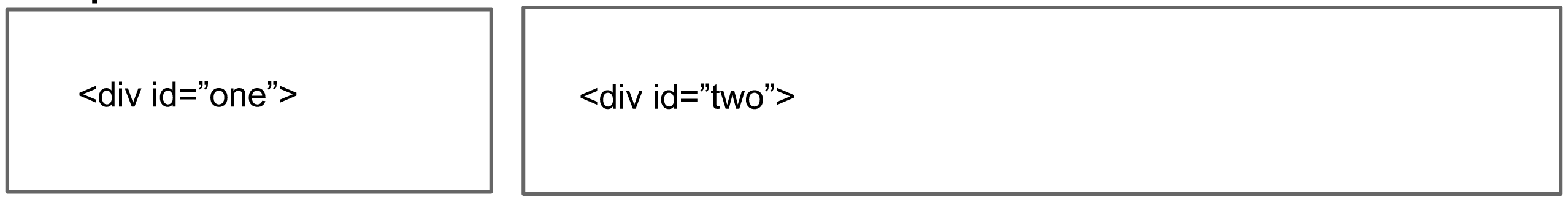
Parallel div containers
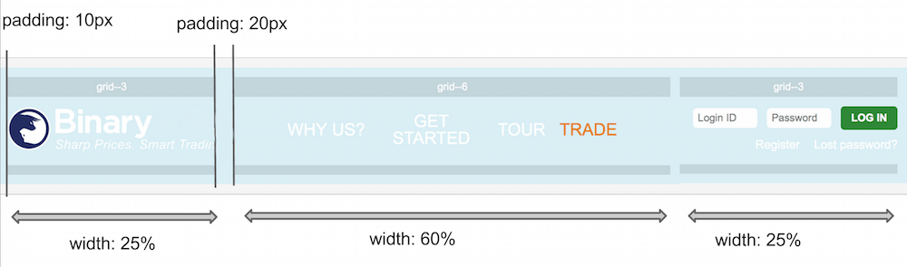
| Old way of styling | Gridle way of styling |
|---|---|
|
#one { float: left: width: 300px; margin-right: 20px; } #two { float: left; width: 600px; } |
Add class grid-3 to #one container and Add class grid-6 to #two container. It will automatically assign float, width and margin automatically, so html will be like this <div id=”one” class=”grid-3″></div> <div id=”two” class=”grid-9″></div> |
Final Thoughts
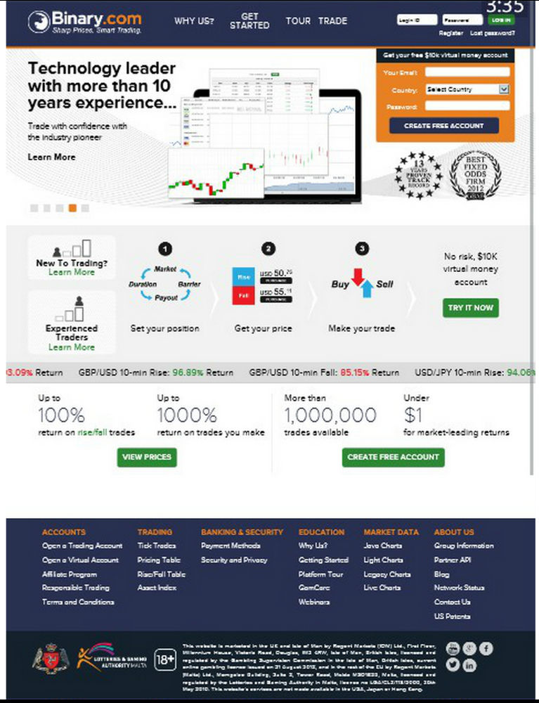
This was extremely fun and challenging project to work with, it is still work in progress as we still have to optimized for phablet devices. Outcome of the responsive design can be seen as per below images or visit binary.com. Let me know your thoughts, hope you enjoyed reading the post
Look of old binary.com before responsive project on mobile device, text is blurry because of scaling by mobile browser

Look of website after responsive project, text is crisp and readable